
I’m relatively new to Football Index – around 3 months of actually trading – so I’m still in the process of trying to understand the platform. Before picking up Football Index, I hadn’t tried any form of trading and barely even any standard gambling. I watch football week-in-week-out and played it for most of my life, but probably don’t have the depth or breadth of football knowledge as some other traders on the Index. Therefore, I thought to use my only half-decent skill set to understand how the market works: data analysis. I haven’t seen too much of this in the Football Index community, at least publicly. There’s people producing data, presenting data and using data to discuss players, but no-one really sharing the details of their rigorous statistical analysis.
I’ve decided that I’m going to write up my data analysis exploration in articles, whenever I’ve got something interesting to talk about – think of it as Dry Off Your Cheeks’ Football Index diary. I’m doing this mainly to provide structure to my analysis and force myself to be extra-critical of my work. But I also thought sharing my work might help traders get a better understanding of data analysis, how it can be used and the things you should be considering when working with data. With that in mind…
*** Disclaimer
Treat all of the conclusions presented with scepticism. As with any data analysis, there are assumptions made and limitations involved that can make the conclusions imperfect – I will try and talk about these as much as possible. This analysis is simply my attempt at using data analysis to help understand the Football Index market.
***
Analysing the quality of PB performance measures
Motivation
A variety of different measures get thrown about in the Football Index Twitter community to talk up, or down, a player. There is sometimes a bit of discussion on which measures certain traders prefer and why, but no one ever seems to gives any statistical evidence to support any measure. So, I’ve decided to have a go here.
PB Performance Measures
The PB performance measures included in the analysis are just the ones that I see posted the most on Twitter, these are:
– Average PB: Mean of the player’s PB scores
– Average PB & Std Dev: Mean of the player’s PB scores plus Standard Deviation of the player’s PB scores
– Max PB: Maximum PB score of the player
– PB Scores over 200: Count of the player’s PB scores over 200
– PB Scores over 225: Count of the player’s PB scores over 225
– PB Scores over 250: Count of the player’s PB scores over 250
– Average of Top 5 PB: Mean of the player’s 5 highest PB scores
– Average of Top 3 PB: Mean of the player’s 3 highest PB scores
I’m sure I’ve missed a few – if I have let me know and I might be able to add them in.
Data
All of the data I’m using comes from the wonderful Football Index Edge. Because of this, the data used only cover the 2019/20 season (under the current PB matrix). As a side-note, Football Index Edge’s new spreadsheet is a game-changer. Well-formatted, easily-linked, downloadable data is essential for in-depth analysis and the more that becomes available the better analysis we’ll see throughout the community.
Relationship between PB performance measures and past dividends won
The first thing I wanted to understand was how the PB performance measures related to PB dividends won – a measure that’s not related to winning dividends is pretty useless. To do this, I’m starting by using standard linear regression. This allows us to model a linear relationship (draw a straight line) to represent how a change in one variable (the PB performance measure) is related to a change in another variable (PB dividends won). I’ve carried out this analysis at the player level, calculating the above PB performance measures and total dividends won for each player during the 2019/20 season (up until 8th June 2020). I’ve removed players with less than 10 matches played, as those with small sample sizes will add unreliable data to the model.
Statistical note: An assumption of linear regression is that the residuals are normally-distributed. PB dividends won is distributed such that, when it’s used in its raw form, this assumption is violated. To resolve this, in a simple way, we transform PB dividends won by taking the natural log. Using this transformed variable in the linear regression model, we no longer violate the normality assumption.
Limitation 1: I’ve had to side-step a statistical issue, caused by the fact that a large share of players have won zero PB dividends, by excluding these players from my analysis. This means that the analysis isn’t relevant for those players with such low PB scores that dividend wins are unlikely. This is an issue I’m going to return to in future analyses.
Limitation 2: I’m wary that I might not be treating the PB Scores over X correctly. It’s currently included as a continuous variable, but should likely be modelled as the count variable that it is. It also suffers from the issue of having a large share of zeros, as mentioned in Limitation 1.
I’ve run a separate linear regression model for each of the PB performance measures. As you would expect, there’s a positive and significant (the statistical definition of the word) relationship between all of the PB performance measures and PB dividends won – post higher PB scores and you’ll likely win more dividends. What I was most interested in, though, was which measures were most strongly related to dividends won. After running the linear regression models I’ve analysed three common “goodness-of-fit” measures: adjusted R-squared, Akaike Information Criterion (AIC) and Root-mean-square error (RMSE). These essentially measure how well the PB performance measure explains PB dividends won – to compare the quality of the measures we can compare how well they explain past dividends won.

Statistical note: In order to include the three goodness-of-fit measures on the same chart, I have standardised the values – there’s little meaning to the values themselves except for comparing across PB performance measures. I have also changed the sign (multiplied by negative one) the AIC and RMSE – normally a higher AIC/RMSE suggests a poorer model, but in this chart it suggests better.
What’s immediately obvious, and is seemingly becoming common knowledge in the community, is that a player’s Average PB is not greatly related to the amount of dividends the player has won. What’s more surprising is that many people’s go-to – Average PB plus Standard Deviation – appears to also rank fairly low. The measure PB Scores over 250 likely suffers from the fact that scores this high are quite rare and its counterparts, PB scores over 200 and PB Scores over 225, seem to hold a stronger relationship with dividends won. The two measures that stand clear above the rest are Max PB and Average of Top 3 PB. The former is often touted by traders as the key measure to use. The latter, however, we probably don’t see enough.
Limitation 3: This section of the analysis is purely backwards facing. It only describes the observed relationship between a player’s PB performance measure and their dividends won over a past period of time. This analysis does not provide any information on how well these measures predict or forecast future events.
This is where my suspicion of PB Max arises. When looking backwards, it’s obvious that a player that has a high maximum PB Score will likely have won dividends. The problem is, from the numerous PB scores that a player has recorded, you’re only looking at one data point when you look at Max PB. With randomness, any play could post a very high PB score once and win dividends, but there’s no indication of whether or not the player will hit that high PB score again.
Repeatability of PB performance measures over time
This is where the issue of repeatability is important.
Knowing how well a PB performance measure relates to past dividends won is pointless if that measure is not repeatable in the future. In statistical terms, this translates to needing to understand how well each measure predicts its future self.
I carry this out in its most basic form. For each player, I order their matches played chronologically and split them in half into two groups: period 1 and period 2. I then calculate the PB performance measures for each player in period 1 and in period 2. Again, I limit this analysis to players with a large enough sample size. Here, that means including players with at least 20 matches played, at least 10 in each period.
Using the same technique as before, we model the linear relationship between each PB performance measure in period 1 and the same PB performance measure in period 2. The “goodness-of-fit” measures, therefore, show how well a PB performance measure can explain its future self, how repeatable it is in the future (or at least from one period to the next). The “goodness-of-fit” measures are the same as those used above.
Statistical note: The AIC and RMSE measures depend on the scale of the dependent variable. In this analysis, the PB performance measures are used as the dependent variable in each model and they have vastly different scales. Therefore, prior to applying our linear regression model, we must transform all of the measures to the same scale – here, I standardise each of the variables using z-scores.
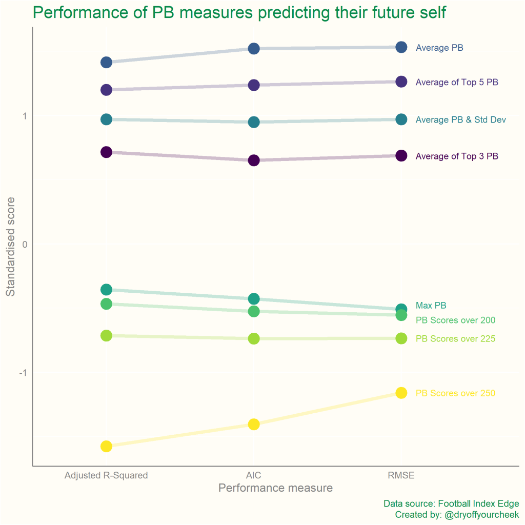
The three PB Scores over X measures perform noticeably badly – this could be due to the inflexible boundaries they impose on the data. It’s worth noting that this could also partly reflect the concerns raised in Limitation 2. My prior hunch regarding PB Max, however, is certainly supported here. Its ability to forecast itself is shown to be fairly poor compared to other measures. The four “Average” measures are the most stable over time and this feels intuitive. A measure that is an average incorporates additional data points and the more data points used, the more stable a variable will become. This point is nicely displayed here, where increasing the number of PB scores included in the average from 3 to 5 to all of them, shows progressively more repeatability.
The Trade-off
Here I am singing the praises of how repeatable Average PB is, after slating its ability to explain past dividends won. This is the trade-off we need to consider. The reason that Average PB is so repeatable is the exact reason why it’s worse at explaining dividends won – the data have been smoothed too much. What we want is a measure that’s able to highlight a player’s ability to hit peak scores, but that also uses as many data points as possible to ensure it’s repeatable in the future. This trade-off is presented below.
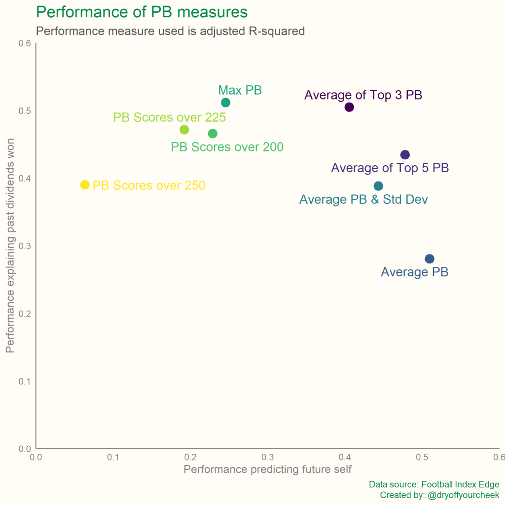
The two extremes are present. Average PB is more repeatable, but is worse at explaining past dividends won, while Max PB displays the polar opposite – less repeatability, but a closer relationship with dividends won. Using the average of a player’s top scores appears to strike a decent balance between the two, particularly the Average of a player’s top 3 PB scores. It rates similarly to Max PB in terms of explaining past dividends won, but is much more repeatable over time.
Limitation 4: While both the ability to explain past dividends won and the ability to predict future self are important traits, the chart above suggests the two are equally important. This likely isn’t the case, but I don’t have the answer as to which should be weighted higher – this should be something you consider yourself.
Conclusions
As I said in the disclaimer, there are never any perfect conclusions – I’ve tried to note all the limitations, assumptions and simplifications involved in this analysis. However, the analysis does offer some guidance as to which PB performance measures traders might want to consider and which should be taken with a pinch of salt. Beyond this, I hope the article’s shown how data analysis in Football Index can go beyond presenting data on players and actually scrutinise how and why we’re using the data.
